Updated on 5 March 2017 (Harvard referencing)..
22 July 2016. A first opportunity to test whether I am able to emulate rather than illustrate using paint instead of drawing equipment. I think I realised now that, when my tutor told me to be more creative, she was not talking about the ideas I want to transport, but my use of colour. To be honest I am a bit confused at the moment, because I need to take the study guide as a rough framework only and chose whatever I feel is adequate as a technique. There is so much contemporary work around that I do not know where to start to take me off my well-worn tracks.
First of all I had another look at Vitamin P (Schwabsky, 2002) and some of the more figurative painters:
23 July 2016. Karen Kilimnik (*1955), an American installation artist and painter, was the first of these, with three examples of seemingly naive but artificial-looking portraits on (Schwabsky, 2002, pp. 174-175 ). I have never been sure whether to feel attracted or repelled by “pseudo-naive” art and an interview I found made me feel strangely alienated from her (Mulleawy and Mulleawy, 2011). The answers she gives appear deliberately both careless and cryptic. Since I am looking for inner resonance, I decided that I would leave her for the moment.
When studying the examples included by Marlene Dumas (*1953, South Africa) I feel less distance. Her subjects radiate more than sheer presence, they present a fate on their skin (Schwabsky, 2002, pp. 100-101). On the other hand, Dumas actively employs “marketing gags” by addressing our animal instincts in order to attract attention. This is something I have always had a big problem with myself. I am no self-promoter at the best of times and have self-inflicted moral standards, which I feel are getting in my way of developing into a 21st century artist.
For me it is far easier to connect with John Currin (*1962, USA) and his paintings (e.g. Schwabsky, 2002, pp. 68-69), which transport famous historical subjects into the present. While I do not like his in places gaudy style, the absurd situations and combinations resonate as if we shared a common language.
German-born Eberhard Havecost (*1967), on the other hand, captures fleeting everyday moments, seemingly irrelevant scenery and at the same time lifestyles typical of the 21st century (Schwabsky, 2002, pp. 136-137). Although to me the chosen subjects appear cool and unengaged from the painter’s perspective, I have always liked the idea of paying attention to the sideshows of life. His way of painting reminds me somewhat of the approach typical of Lomo photographers (Lomography, 2017). Very similar approaches are chosen also by the Swedish Cecilia Edefalk (*1954, Sweden) (Schwabsky, 2002, pp. 102-103), Wilhelm Sasnal (*1972, Poland) (Schwabsky, 2002, pp. 288-289), Mantalina Psoma (*1967, Greece) (Schwabsky, 2002, pp. 262-263), Elizabeth Peyton (*1965, USA) (Schwabsky, 2002, pp. 244-245), or even my former school colleague and successful painter, Lisa Kunit (*1966, Austria).
All of the above have in common a relatively naturalistic style reminding of photography depicting everyday subjects in a quasi apropos fashion, which in Vitamin P is described as an indicator of contemporaneity (Schwabsky, 2002, p. 287). But Vitamin P was published in 2002 originally and contemporaneity will without doubt have moved on since then. So I moved on to study the contemporary artists suggested by my tutor.
From the first moment I loved the weird use of colour and the wonderfully ironic approach by Glenn Brown (*1966, UK) (Brown, 2017), as e.g. in “The Dance of the Seven Veils” (Brown, 2014) or “Cactus Land” (Brown, 2012) and a video (Gagosian Gallery, 2014). Less sure what to make of her work I am when looking at Stella Vine (*1969, UK), here is a selection (Vine, 2017a, scroll down a bit for the great number of portraits). When reading the analysis (Vine, 2017b) of her personal approach posted on her website, it reads like a page-long apology to the art market and like the diary of a girl who tries to make sense of the world that keeps hurting her. Alex Katz (*1927, USA), who held a retrospective exhibition in Salzburg in 2013, I think might serve as a template for all the painters mentioned above. His approach is like that in 21st century painting, his subjects appear largely uninvolved (type “Alex Katz” into the image browser to get an overview). I wonder why this “cool”style bears such an attraction to the viewer. Maybe it leaves open a lot of room for interpretation, but I find that extremely difficult to tolerate in my own painting. I want to transport stronger feelings and it makes me hurt if I can find none.
Since, however, I first need to get into a habit of sketching with paint, I went to look for methods of doing so. Denis Castellas (*1951, France) uses a way of combining painted shapes and line, which looks very attractive to me, although I guess that there is a major element of drawing in his sketches (Schwabsky, 2002, pp. 62-63). Similar, but more energetic, are the sketches by Merlin Carpenter (*1967, UK, Schwabsky, 2002, pp. 60-61). Again, the figures remind me of photography. The painted areas behind and to the sides help to position the figures in space and support the movement. Since this was not quite enough to establish a firm background, I searched for “figure sketching contemporary” on the web. Most of what I came up with was of course drawing, but I found a selection of painted sketches by Robert Burridge (*1943, USA), which strongly appeal to me, e.g. “Seated Nude” (Burridge, n.d.(a)), “Blue Nude” (Burridge, n.d.(b)) and “Suze” (Burridge, n.d.(c)) . I would like to learn a style like that in my painted sketchbook. Regarding tone I was advised by my tutor to have a look, among others, at the work of Euan Uglow (1932-2000, UK). Again the subjects appear distant and uninvolved, but the use of tone in his nudes is wonderfully delicate and I am quite drawn to the structure and colour of his backgrounds (Plotkin, 2010).
24 July 2016. Bearing the above and my subject idea in mind I prepared two split backgrounds, one monochrome and one using the colours I had left over from the previous exercise, in my square sketchbook and I tried to paint my husband kneeling down in my workshop, pretending to do some garden work. I had to work fast and divide the work up into several very short sessions, since the position was very awkward to keep for more than a very few minutes. These are the results (Fig. 1-2):
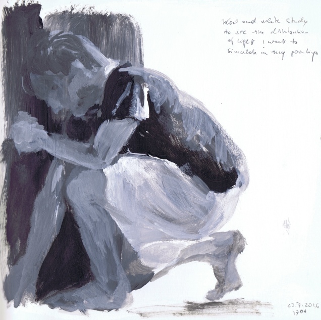

I prefer the black and white version, also because my husband appeared more relaxed the first time over. In the coloured sketch it is obvious that the position hurt both feet and spine. Overall I was surprised that it was possible to create, in a very short time, a believable impression of volume and movement in my square 20 cm sketchbook with a comparatively large flat brush. In the coloured study my husband’s face is relatively close to life also. I will have to give the background of the finished painting particular attention, however. This is not a particular strength of mine yet. In order to make progress here, I will refer to the researched artists, in particular “Suze” by Robert Burridge (see above).
For the painting itself, my husband attending to the maize plants in our little “urban plot”, I prepared a 60 x 80 cm painting carton with a split background layer, one with my “skin” colour and one with a mix of sap green, yellow and primary blue for the maize. I would like to keep and improve on the above loose style here and will see whether I am able to do this on a larger scale, while keeping in mind a what I think might be a contemporary approach to the subject (Fig. 3).

2 August 2016. After a very intense 10 days doing other things, including having to find a new lawyer, again, and painting our son’s bedroom after a planning phase of a mere 4 years (:o)), I finished my exercise yesterday. I could have gone on forever, proesumably, but my tutor pointed out to me to be more sensitive about when to stop painting and there was a clear message by the painting, saying “Enough!” So this is what I got (Fig. 4):

There is a certain roughness in my approach to the subtle tonal differences on skin and fabric, but I decided that I would not refine them in order not to destroy the loose painting. In some places I think that the technique was quite successful, especially when looking at both hands and arms with the light coming from behind. I was also quite happy with the fabric and face. Less successful were the legs, but the photo looks much worse in this respect than the actual painting. What I like in the background was the effect of the white behind my husband’s back and the darker earth colours left of his knees, both helping to shape the volume of his body. With a few exceptions I think that I was successful in using tonal differences in forming a believable representation of a three-dimensional body in space.
References:
http://glenn-brown.co.uk/artworks/250/#selected_mediums=13
Burridge, R. (n.d.(a)) Seated Nude [sepia and India ink on BFK Rives white drawing paper] [online]. Robert Burridge, Arroyo Grande. Available at: http://www.robertburridge.com/contemporary_figure_drawing/page17.html [Accessed 22 July 2016]
Burridge, R. (n.d.(b)) Blue Nude [acrylic on gessoed Fabriano watercolour paper] [online]. Robert Burridge, Arroyo Grande. Available at: http://www.robertburridge.com/contemporary_figure_drawing/page1.html [Accessed 22 July 2016]
Burridge, R. (n.d.(c)) Suze [acrylic on gessoed Fabriano watercolour paper] [online]. Robert Burridge, Arroyo Grande. Available at: http://www.robertburridge.com/contemporary_figure_drawing/page12.html [Accessed 22 July 2016]
Gagosian Gallery (2014) GLENN BROWN at Gagosian West 21st Street, New York [online]. Gagosian Gallery, New York. Available at: https://www.youtube.com/watch?v=ZGgzv5-dBnc&feature=player_embedded
Kunit, L. (2017) Galerie [online]. Lisa Kunit, Vienna. Available at: http://www.lisakunit.at/website.php?Q=4 [Accessed 22 July 2016]
Lomography (2017) Photos [online]. Lomography. Available at: https://www.lomography.com/photos/ [Accessed 5 March 2017]
Mulleavy, L. and Mulleavy, K. (2011) Karen Kilimnik [online]. Interview Magazine, 15 March 2011. Available at: http://www.interviewmagazine.com/art/karen-kilimnik/#_ [Accessed 22 July 2016]
Plotkin, N. (2010) Euan Uglow [online]. Painting Perceptions, San Diego. Available at: http://paintingperceptions.com/euan-uglow/ [Accessed 22 July 2016]
Schwabsky, B. (2002a) Vitamin P: New Perspectives in Painting. Phaidon Press.
Vine, S. (2017a) Paintings, Drawings and Objects [blog] [online]. Stella Vine, Alnwick. Available at: https://stellavine.com/ [Accessed 6 March 2017]
Vine, S. (2017b) Stella’s Journal [blog] [online]. Stella Vine, Alnwick.
Available at: https://stellavinejournal.com/ [Accessed 6 March 2017]

Nice one Andrea I enjoyed checking out your references. I bought P2 todayand 100 paintings that will define our age. Amazon will deliver in the blink of an eye or sooner. Ican understand the standing on the shoulders of giant up until the 1970’s, now its time to get up to date. i particularlylike Suze from your references. Your final painting looks very contemporary.
LikeLike
Hi Mick, thank you – I am just coming to grips with what is expected from us and suddenly it all starts making sense. I think that in places the study guide may be a bit misleading by probably not being up to date with the new tutoring approach, but I hope I got this problem sorted now.
For me unfortunately it is less straightforward to order English language books from Amazon. My local .de address (Germany operating for Austria) will answer orders by passing me on to the .com address, which I understand to be the US site. It can be very awkward to order from there, since many items must not be shipped to Europe, for whatever reason, and when I succesfully place an order, the delivery time is a month (apart from being horrendously expensive). I am thinking of buying P2 nevertheless, it will accompany me for many years to come.
Andrea
LikeLike
Nice work. I particularly like the colours in no 2. Helpful husband! (don’t think mine would go along with this!). Are you on the drawing or painting course? just wondered because I’ve been thinking a lot about what constitutes a drawing and what a painting.
LikeLike