Updated on 20 February 2017 (Harvard referencing).
12 April 2016. Since the exercises on mixing colours are intimately connected, I waited until I had completed all of them in order to write a summary of the experience, which, as has been noticed by a number of fellow students before, required the input of
enormous amounts of paint and time. In return it gave a growing understanding of the nature of colour and, in the case of some of the experiments, a near-meditative peace of mind.
Exercise 1: Mixing greys – anachromatic scale
Since I had no previous experience whatsoever regarding the proportions of white and black needed in producing a sensible number of steps for the above scale, I started ever so carefully, adding only minute quantities of black each time. This resulted in a relatively impressive 64 shades in total (see Fig. 1 below). At the dark end of the scale the differences are unfortunately very difficult to see in the photo. With my limited knowledge of photo editing I made things not much better, but in nature there is a continuous darkening visible. Interestingly, I went through three cycles of mixing in black and adding to the darker end of the scale before my eyes/brain would agree that NOW there was a real difference to the shades put on before. When, in the end, looking at the result, the scale went smootly from white to black.

Taking two small pieces of paper with neutral grey and placing them on both ends of the scale as advised in the study guide, revealed that the same tone looks darker near white than near black (Fig. 2a and 2 b below). According to Chevreul’s idea that the brain tends to exaggerate differences in tone in order to allow a clear differentiation – see my previous post on Chevreul’s colour theory (Lacher-Bryk, 2016). I assume that probably the real differences may be less prominent on both ends of the scale.


The neutral grey produced in the above exercise I then used to prepare an A2-sized ground on acrylic paper. Despite having assumed that I had mixed my grey very thoroughly I noticed differences in tone across the ground. So I made a mental note that it would be necessary to work extremely thoroughly with totally clean tools to achieve acceptable results during the exercises to follow.
It took me two whole days to complete the experiments below and left me with literally kilograms of little heaps of mixed paint. Since I have no use for them in the near future it will mean having to discard them with mixed feelings. So I took a souvenir photo of the lot (Fig. 3):

The following photo shows an overview of the colour mixing exercises (Fig. 4):

Exercise 2: Primary and secondary colour mixing
To be honest, I am the owner of only a few hues of acrylic paint. I like mixing and I have accumulated some intuitive experience in decades of watercolour painting. Of course, there are some important differences when mixing acrylic paint when compared to watercolour, in particular the source of white mainly as paper white in the one case, and white pigment in the other.
So here is my modest selection of primary colours (Fig. 5):

In the case where I had only two hues of a colour (yellow and red) swapping their positions had no effect regarding the perceived relative tone, but in my opinion it does make a difference to the story told by the hues, tiny as it may be, when reading from light to dark or vice versa. With the blues, however, the primary blue (cyan) looks lighter when placed between two darker colours (ultramarine and bluegreen in my case) than when it sits to the side of the darker hues. The most intense hues of the above were primary red, Naphthol red deep and primary blue (cyan), so I used these in the following mixing experiments (Fig. 6):

The first thing I noticed when comparing the three sets of scales was that identical handling does not produce scales of equal length. While the change from yellow to red was achieved comparatively quickly and the mixes on the red side of the scale look relatively similar (not only on the photo but also in reality), the change from yellow to blue produced an enormous variety of clearly different greenish hues. I even ran out of paper at the end of the scale and had to stop it more abruptly than intended. The mix between red and blue produced did produce some of the murky dark mix mentioned in the study guide, although I would rate some of the hues towards the blue end of the scale as something like violet.
Still, testing other combinations of blue and red in order to make more believable violets gave the following results (Fig. 7). The photo, unfortunately, does not faithfully reproduce the hues especially in the top row, but the most convincing results came from primary magenta mixed with primary blue (bottom row).

The most time and paint-demanding experiments of this exercise were those aimed at mixing secondary colours in the above manner but trying to keep tonal values constant. I continued mixing in the second colour plus white until the hue of the white+colour mix was the same as the original second pigment. A whole day was devoted to the following three scales (Fig. 8):
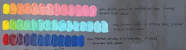
The first thing to mention here is that I may have misinterpreted the instructions. I don’t know whether I may have been required to mix in some white with the starting primary colour, too. I did not and in the case of yellow as starting colour this meant that I had to add ten times the amount of white, and sometimes far more, with each tiny blob of secondary colour in order to keep tonal values constant. This also meant discarding enormous amount of paint each time I started another hue. Interestingly, the same effect was not noticeable after two thirds of the red to blue scale. There were 12 steps in the scale and no white had to be added after step 8. I have no valid explanation for the phenomenon yet, but maybe the red in this case has a slightly darker tonal value than the blue, so when having got rid of the difference by mixing in white for a while, the adding of more blue would not make any further changes to the overall tonal value. Or it may be my eyes, which are not yet expert at recognising small tonal differences with certainty. However, although I can see some fluctuations, I am quite pleased with the outcome. Considering the differences in darkening through drying in different hues of acrylic paint I was surprised to see a relatively smooth result. The brownish grey I was supposed to see halfway through the red to blue scale according to the study guide was not really there apart from the third mix from the left, but I may have msjudged the amount of colour to mix in in the first step, so there is a chance of having missed some information here simply by low resolution.
Exercise 3: Broken or tertiary colours
In the last exercise, requiring the mixing of secondary colours, the occurrence of grey was perfectly visible in the case of a scale between orange red to green blue, but was completely missing in the transition from sap green to vermilion. Maybe the mustard colours to the right of the sap green count as broken or tertiary colours without being grey. They certainly lack chroma when compared to the original colours (Fig. 9).

A phenomenon I noticed in all the mixing experiments was the different qualities of the colours chosen to mix, which resulted in skewed transitions in some instances. For example, in the mixing of primary colours the transition from yellow to red was fast, so that most of the scale I would describe as reddish. The same effect was visible in e.g. the transition from yellow to blue shown in the second photo from the bottom, second row, and in the last of all mixes from sap green to vermilion. I would tend to describe the scale as orange-dominated. It would be interesting to have other people look at the scales to see whether their perception matches my own.
Experimenting in this way was a major hint regarding both the incredible properties of colour and the power of human perception. It also makes my head swim to think of the worlds I need to discover yet. No wonder we are all addicted to colour.
References:
Lacher-Bryk, A. (2017) ‘Research point: Chevreul’s colour theory’ [blog]. Andrea’s OCA painting 1 blog, 3 Apr. Available at: https://andreabrykocapainting1.wordpress.com/2016/04/03/research-point-chevreuls-colour-theory/ [Accessed 20 February 2017]
